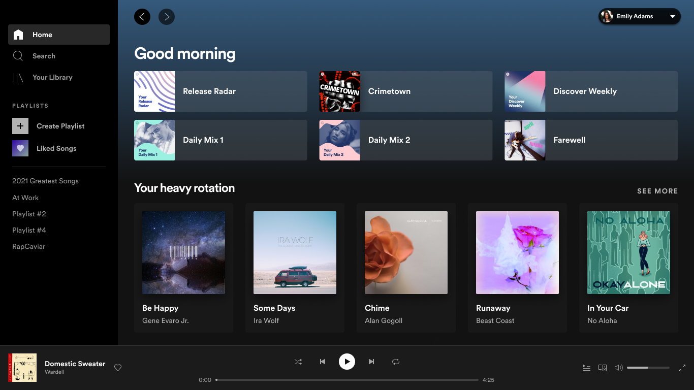
Spotify is getting a fresh coat of paint today for those of us tuning in from a desktop or browser interface. The changes are rolling out today on Mac and Windows and through the web. The changes focus on improving navigation and providing users with access to new controls across the Spotify features.

The changes are focused on streamlining the experience. You’ll see the search bar is removed from the top left and that Your Library stands alone instead of showing all of your nested playlists.
Speaking of playlists, there are new features to allow you to write descriptions, upload your own photos and drag/drop tracks into existing playlists. They add a search bar to make it easier to add tracks to playlists. They want to nurture curators who put a lot of effort into thoughtful playlists.
“At Spotify, we’re always looking for ways to provide the best possible experience so our listeners can consistently discover and enjoy music and podcasts—and that includes look, feel, and functionality. We constantly test, develop, and launch new features, optimize for new devices, and look to expand our content offering. Yet along the way, we felt that our desktop app experience hadn’t kept up, and that it was time for a change.”


